
Best Backsplash Colors for Kitchens That Last
A backsplash may cover a relatively small area, but it sits directly between the cabinets, countertops, appliances, and work zones that define a kitchen. That is why choosing the best backsplash colors for kitchens is less about following one trend and more about making the entire room look intentional. The right color can brighten a compact kitchen, soften a busy countertop, or add depth to a clean cabinet layout. The wrong one can make expensive materials compete.
For a finish that holds up visually as well as physically, start with the fixed elements of the room. Cabinet color, countertop pattern, natural light, and grout selection should guide the decision before a tile is ordered.
Start With the Countertop, Not the Paint
Paint is easy to change. Countertops, cabinetry, and tile are not. A backsplash should usually relate to the countertop first because the two surfaces meet at the same visual line and are seen together every day.
If the countertop has strong veining, movement, or multiple colors, a quieter backsplash is usually the safer choice. A warm white, soft cream, pale gray, or light greige tile can give the countertop room to stand out without making the kitchen feel plain. On the other hand, a solid quartz or simple stone counter can support a backsplash with more color, texture, or pattern.
Pay close attention to undertones. A white quartz countertop may lean cool blue-gray, while white cabinets may have a warmer ivory cast. Pairing those surfaces with a bright, stark-white backsplash can make one of them look yellow or dingy by comparison. Bring samples into the kitchen and view them against the actual cabinets and counters, not just under showroom lighting.
Best Backsplash Colors for Kitchens by Cabinet Color
There is no single best backsplash color for every kitchen. Cabinet finishes establish the strongest visual field in the room, so they provide the clearest starting point.
White cabinets
White cabinets work with nearly every backsplash color, but that flexibility can lead to overcomplicated choices. For a clean, lasting look, white or off-white tile with slight variation is dependable. It keeps the kitchen bright while adding more depth than a flat, matching white surface.
Soft gray, pale blue-gray, light sage, and muted taupe also work well with white cabinets. These colors introduce contrast without making the backsplash feel like a separate design statement. For homeowners who want a stronger focal point, deep navy, charcoal, or a rich green backsplash can provide contrast, especially when the countertops are simple and the kitchen has good natural light.
Gray cabinets
Gray cabinetry needs a backsplash that respects its temperature. Cool gray cabinets pair naturally with crisp white, cool white, blue-gray, and light charcoal tile. Warm gray cabinets, often described as greige, generally look better with creamy whites, beige-toned stone, soft taupe, or warm gray tile.
Avoid selecting a gray backsplash just because it matches the cabinet color. Similar grays with different undertones can clash, and too much of one mid-tone gray can leave the kitchen looking flat. Contrast in shade, texture, or tile shape helps create separation.
Wood cabinets
Natural wood cabinets are back in demand, from light oak to rich walnut. Their backsplash colors should complement the wood's warmth rather than fight it. Cream, warm white, sand, taupe, muted green, and handmade-look blue tile all work well depending on the countertop.
Light oak cabinets often look sharp with a creamy backsplash and dark accents, while walnut can handle lighter stone-look tile or a soft green ceramic. If the wood grain is pronounced, keep the backsplash pattern controlled. Too much movement in both surfaces can make the wall feel crowded.
Dark blue, green, or black cabinets
Dark cabinetry creates a strong foundation and often benefits from a lighter backsplash. Warm white, ivory, soft gray, and light natural stone colors reflect more light and keep the kitchen from becoming overly heavy. A backsplash with gentle texture or variation can be especially effective because it adds interest without reducing brightness.
A dark-on-dark backsplash can work in a large kitchen with substantial windows, layered lighting, and light countertops. It is a deliberate look, though, not the default choice. In smaller kitchens, dark cabinets and dark tile can absorb too much light unless the design is carefully balanced.
Neutral Does Not Have to Mean Plain
Neutral backsplash colors remain the most practical choice for many homes because they work across changing decor, paint colors, and hardware finishes. That does not mean every neutral backsplash needs to be glossy white subway tile.
Warm white tile, light greige porcelain, cream zellige-style ceramic, pale limestone looks, and soft beige stone mosaics can all create a refined neutral kitchen. The difference is in the finish, variation, layout, and grout. A matte tile feels quieter and more contemporary than a high-gloss finish. A stacked layout feels more tailored, while a running-bond pattern has a more traditional rhythm.
For resale-minded homeowners, a light neutral backsplash is a sound choice when paired with quality installation. It gives future buyers a kitchen that feels complete without limiting their ability to add their own color through stools, lighting, or accessories.
Use Color Where It Adds Purpose
Colorful backsplashes are most successful when they have a clear job in the design. In a mostly white kitchen, a muted blue, green, or terracotta backsplash can provide the visual anchor. In a kitchen with plain slab cabinets and simple counters, a patterned tile may create needed character.
Muted shades generally age better than highly saturated trend colors. Sage green, dusty blue, deep navy, mineral green, and clay-toned terracotta have enough presence to feel personal without overwhelming the room. They also relate well to natural stone, wood, brass, and black hardware.
If you are considering a bold color, test a larger sample near the cooktop and under-cabinet lighting. Tile can appear dramatically darker once it is installed across a full wall or behind a range. Glossy finishes intensify color and reflect light, while matte finishes soften it.
Grout Can Change the Final Color Decision
Grout is not an afterthought. It changes how tile color, pattern, and maintenance needs read in the finished kitchen.
A close grout match creates a more continuous surface and keeps attention on the overall color of the backsplash. This is often the right move for natural stone, handmade-look tile, or any backsplash with notable surface variation. Contrasting grout emphasizes every tile and joint. It can give white subway tile a classic graphic appearance, but it also makes alignment and installation quality much more visible.
For busy kitchens, very bright white grout may require more upkeep, particularly near the range. A light warm gray or soft beige grout can be more forgiving while still keeping the wall light. The best choice depends on the tile's edges, finish, and joint size, not simply the grout color seen on a sample board.
Consider Light, Layout, and Daily Use
Natural light can shift backsplash color throughout the day. Kitchens in sunny Central Valley locations may handle cooler or deeper colors differently than kitchens with limited daylight or shaded Bay Area exposure. Under-cabinet lighting matters just as much. Warm bulbs can pull cream and beige tones forward, while cooler lighting can make some whites and grays appear sharper.
Layout also affects how much color you see. A full-height backsplash behind open shelving or around a range makes a bigger statement than a standard strip between counter and upper cabinets. Extending tile to the ceiling can be a strong design move, but it calls for a color and material you will be comfortable seeing in a larger field.
Finally, choose a finish that suits how the kitchen is used. Smooth glazed ceramic and porcelain are straightforward to clean. Natural stone can bring depth and character, but it may require sealing and more specific care. Small mosaics offer detail but include more grout joints. A durable backsplash is not just about selecting hard tile - it is about selecting the right material, grout, preparation, and installation for the space.
Make the Final Choice With Real Samples
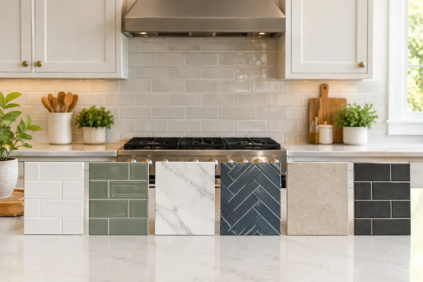
The most reliable way to choose a backsplash color is to compare full-size samples in the actual kitchen. Set them against the countertop and cabinet door, then look at them in morning light, evening light, and with the kitchen lights on. Check the sample from across the room as well as at arm's length.
At Empire Tile & Stone, we encourage homeowners to make these decisions before installation begins, because careful planning protects the finished result. A backsplash should look good on the first day, but it should also continue to make sense after hardware changes, new paint, and years of daily cooking. Choose the color that supports the materials already in the room, then rely on precise installation to make the design look finished.


Comments